One-size-fits-all growth charts are failing to spot at-risk babies, major new BMJ study finds
Published on: 13/07/2026
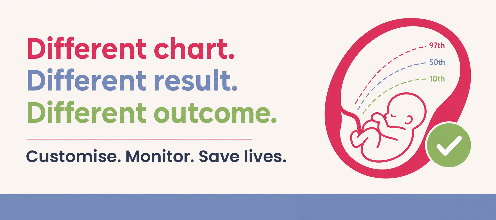
A new study published in The BMJ has confirmed something MAMA Academy has long been raising the alarm about: the growth chart your hospital happens to use can dramatically change whether your baby’s growth restriction is picked up before birth — or missed.
What the study did
Researchers at the Perinatal Institute in Birmingham looked at 3.2 million births across 38 of England’s 42 NHS Integrated Care Boards between 2015 and 2025. They compared how seven different fetal growth charts — Hadlock, Intergrowth-21st, the World Health Organisation (WHO) chart, the Fetal Medicine Foundation (FMF) chart, GROW Lite, and customised GROW — classified babies as small (SGA) or large (LGA) for their gestational age.
Four of those charts (Hadlock, Intergrowth-21st, WHO and FMF) are “universal” — one fixed standard applied to every pregnancy, regardless of the mother. GROW is different: it’s customised to each woman’s height, weight, ethnicity and parity, and was built from UK population data.
What they found
The results were stark. Using the same definition of small for gestational age (below the 10th centile at term), the proportion of babies flagged as SGA ranged from:
- 4.8% with Intergrowth-21st
- 17.2% with WHO and FMF charts
- 12.3% with customised GROW
That’s more than a three-fold difference in how many babies get labelled at risk, purely depending on which chart a hospital has chosen to use — nothing to do with the babies themselves.
NHS England previously issued a safety alert advising against the use of Intergrowth EFW charts by 30th June 2026.
It’s worth being clear about what these numbers actually mean. At first glance, WHO and FMF’s higher percentage might look like they’re simply “catching more babies” — a better detection rate. But that’s not what this is measuring. By definition, an SGA chart is meant to flag roughly the smallest 10% of babies, calibrated to the population it’s being used on. WHO and FMF are flagging 17.2% — well above that 10% benchmark — which means they’re systematically over-flagging, not detecting more genuine cases of growth restriction.
A higher percentage here is a sign of a poorly calibrated chart, not a more effective one. Over-flagging has real costs too: unnecessary anxiety for parents, and scarce clinical time and scanning capacity spent monitoring babies who were never truly at risk, which can crowd out attention for the babies who are.
This is also where GROW’s real strength lies. It’s not just that its overall rate (12.3%) sits closer to the expected 10%. The non-adjustable charts varied widely from one part of the country to another, even when the same chart was in use, because they don’t account for genuine differences between local populations — maternal height, weight, ethnicity and parity all affect what “normal” growth looks like. GROW is built specifically to adjust for those factors, which is why it stayed consistent across different ICBs while the universal charts didn’t. Consistency and accurate calibration, not a bigger flagged number, is what makes a chart safer: it means the babies being flagged are more likely to be the ones genuinely at risk, wherever in the country they’re born.
Why this matters
Fetal growth restriction — when a baby isn’t growing as expected in the womb — is the single most frequent cause of avoidable stillbirth. Spotting it in time is one of the clearest, most preventable ways to save babies’ lives. But if the chart being used to assess growth is inconsistent or poorly suited to the local population, at-risk babies can be missed — or, conversely, healthy babies can be wrongly flagged, leading to unnecessary anxiety and intervention.
As the researchers put it: individual trusts often see these catastrophic-but-rare outcomes too rarely, too late, and too locally to recognise the pattern. It takes a coordinated, national view to see what’s really going on — which is exactly why the authors are calling for urgent, NHS-wide standardisation of growth charts, alongside real-time national oversight of growth assessment quality and safety.
This also lands squarely alongside Baroness Amos’s National Maternity and Neonatal Investigation, which recommended an independent study into the detection rates of the various growth charts in use across the NHS. This BMJ study is effectively that evidence base starting to be built — and it makes the case for it unambiguously.
The bottom line
This isn’t a minor technical debate. Which chart a hospital uses can be the difference between a baby’s growth restriction being caught in time — or not. MAMA Academy will continue pushing for the national standardisation and independent scrutiny this study makes clear is overdue.
You can read the full BMJ article here.
Reference: Gardosi J, et al. Designation of small for gestational age according to seven fetal growth charts in England’s National Health Service: population based cohort study of 3.2 million births. BMJ 2026;394:bmj-2026-433307.